
- Overview
- Toolkit Overview
- Introduction to Data Viz
- Resources
- General Considerations
- Accessibility
- Color
- Types of Visualizations
- Charts
- Dashboards
- Data tables
- Infographics
- Maps
- Qualitative
- Enhancing Engagement
- Animations
- Interactivity
- Presentations
Creating a presentation is an effective way to tell a story with data and display information to accompany a speech or a longer text report. Presentations are typically created using slideshow tools, but they can also be generated using print media or audio and video. Described here are presentation tools that create or support slideshows and video presentations.
Presentations Design Principles
Slide Content
- For the best readability, use a type font size of at least 24 and dark text on a white or lightly tinted background. Sans serif fonts (e.g., Calibri, Century Gothic) are typically easier to read than serif fonts (e.g., Times New Roman, Georgia).
- Keep it simple. Each slide should present just one idea or key point. Focus less on the detailed information (the what) and more on what this information means to the audience (the so what).
- To avoid competing with the spoken text for the audience’s attention, slides should have as little text as possible, but this is no excuse for cryptic slides or for arbitrary word counts.
- For effective redundancy, both slides and spoken text should be able to stand alone.
- Use animation/transitions sparingly. In PowerPoint, use simple animations such as Appear or Fade rather than some of the longer or flashier animations.
- When developing slides, consider how they may be used for the future.
- Including text in the notes section can help ensure that meaningful content not explicitly written on slides is not lost if used by a new presenter or viewed by an audience after the live presentation. Alternatively, be sure to remove any personal information in the notes section that is not intended for a broad audience before uploading a presentation to a public accessible site.
- Recording the presentation is another way to make sure the full content is available to the viewer past the date of presenting.
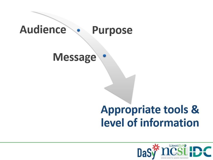
Slide Design
The suggestions below are for the visual arrangement of text, images, and other elements on the slides.
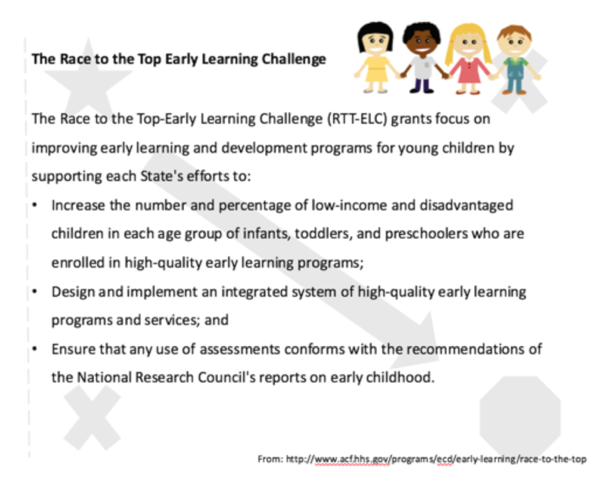
1. Use the Gutenberg Diagram Arrangement Model to draw your audience’s attention to the right place (Evergreen, 2014, p. 126-129).
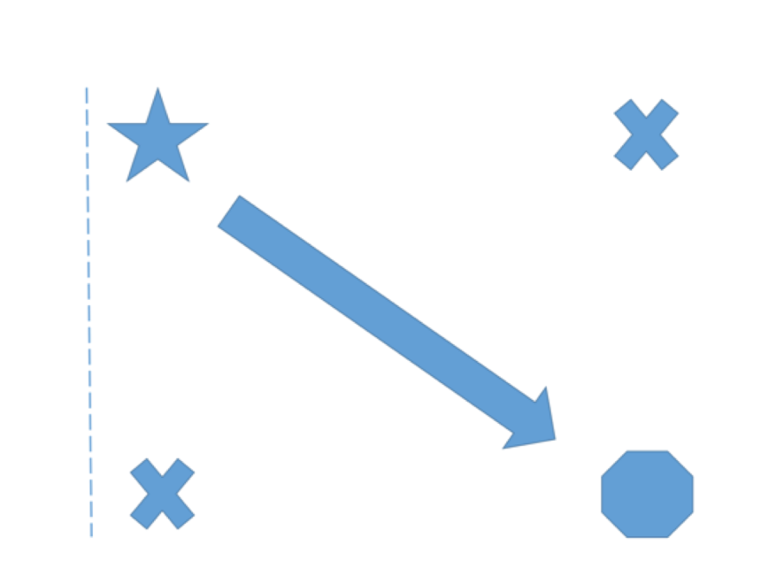
|
Example:
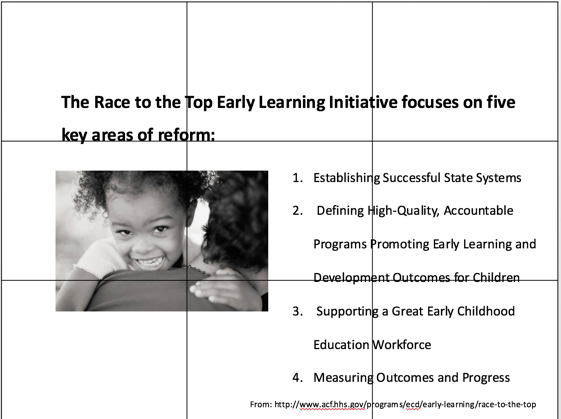
2. Consider the Rule of Thirds (Evergreen, 2014, p. 130-132)
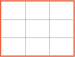
|
Example:
3. Keep in mind other design considerations (Evergreen, 2014, p. 133)
- Elements such as arrows, guiding lines, numbering systems, movement in an image, and other graphic elements can help guide the viewer’s attention to areas of emphasis.
- Leaving wide margins around text helps with readability.
Example:
Enhancing Audience Engagement
The suggestions below are ways to enhance audience engagement using live data visuals:
- Consider using a poll software to gather on-the-spot data from the audience and create instant visuals. PollEverywhere can create visuals such as a word cloud, pie-chart, or table of the audience’s data that could be shared as the audience inputs data during the presentation.
- Some presentations may benefit from the use of animated videos, which can enhance interest and engagement with the use of sound and visuals. An animation can be embedded into a slide deck to introduce a concept or topic and to replace static text. Check out the Animations tile to learn more about what type of information is best displayed using this format.
- Animations may also make static PowerPoint slides more engaging. PowerPoint animations can be used to emphasize and draw attention to certain content by using effects such as “bold reveal.” Ensure that animations are brief and do not distract from the most important content on the page. Generally, animations may make your PowerPoint slides less accessible. Limit the use of animations and avoid any such effects as text flying onto the page, blinking, or flashing.
- Consider general and engagement strategy-specific accessibility tips and principles.
If you wish to make your presentation more interactive, consider using Sway or Prezi as an alternative to PowerPoint. Navigate to the Tools section to learn more about these presentation tools.
Published December 2022.