DaSy Toolkits » Data Visualization
Data are a powerful tool for identifying and addressing inequities. At the same time, data can and have been used to intentionally and unintentionally harm historically marginalized groups. The DaSy Center aims to support Part C and Part B 619 programs in creating data visualizations that are bias-free, respect community norms, tell community-driven stories, and use up-to-date, accurate, clear terminology to maximize understanding of systemic issues and minimize harm. Below are recommendations for inclusive and equitable data visualizations.
Designing with Equity and Inclusion in Mind
- Consider the indirect and direct meaning and usefulness of colors and icons. The Urban Institute’s Applying Racial Equity Awareness in Data Visualization provides helpful pointers on this subject, including:
Read More +
- Avoid incremental color palettes (e.g., light to dark) to represent different demographic groups.
- Avoid color choices, images, and icons that reinforce racial or gender stereotypes, such as colors associated with skin tones or using pink and blue to represent women and men.
- If including images, pay attention to whether photos or images represent the diversity of groups in your data and audience (e.g., choosing images that represent multiple genders, races, and ethnicities). Be thoughtful about the images you include to avoid mis- or under-representation of certain groups.
- Avoid color choices that imply “good” or “bad” for any one group. (See What Disney Villains Can Tell Us About Color Psychology).
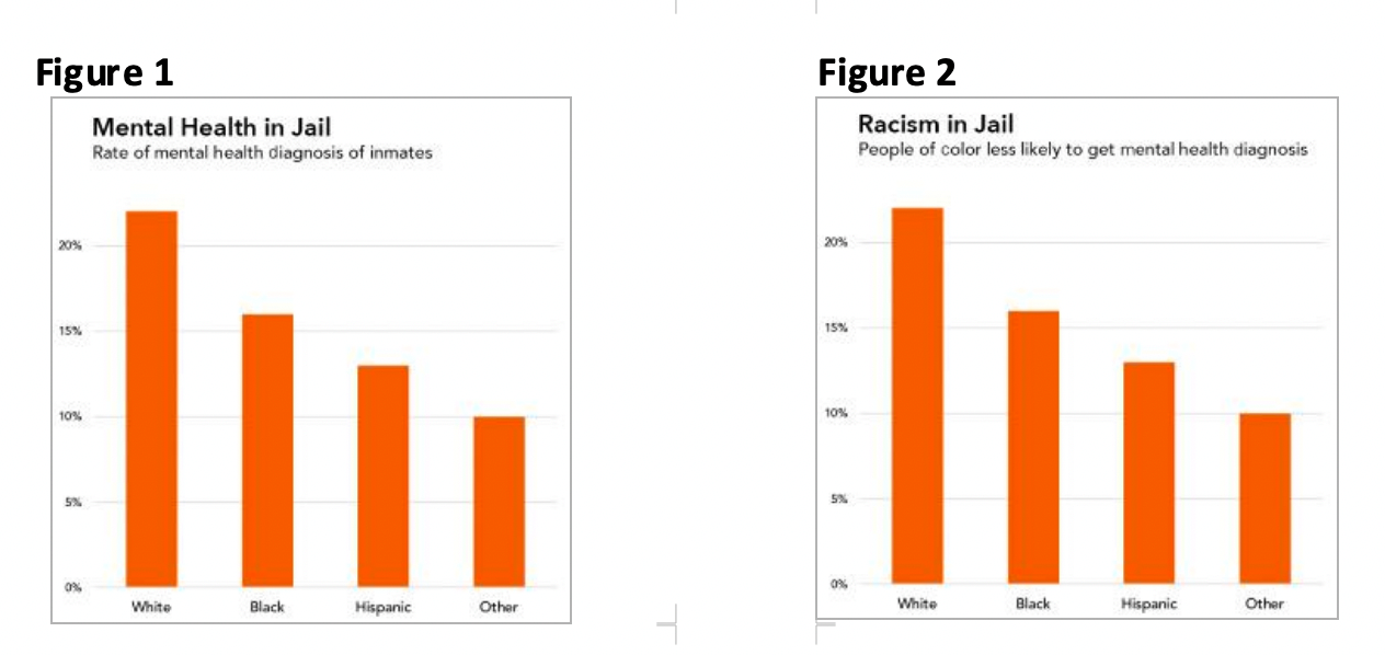
- Provide context. Even in the most powerful visualization, data never speak for themselves. As readers, we bring our own mindsets, experiences, and biases to the data. It’s critical to provide readers with context about the limitations of your data, where the data came from, and the structural inequities present (i.e., key policies, current and past access to resources). For example, if a chart compares child outcomes data by primary home language, it would be important to include context around the languages in which services are offered and whether outcomes vary by location. Context and interpretations are important because, in their absence, sterile data may reinforce readers’ negative stereotypes about marginalized groups rather than illuminate structural causes of inequities. Consider the following practices to provide context:
Read More +
- Be mindful of your labels. Labeling chart elements like categories and values aid readers’ interpretation, but they can also be misused in ways that harm or dehumanize certain groups. The Urban Institute’s Do No Harm Guide provides three key considerations for labeling data visualizations:
Read More +
- Use labels that emphasize people’s humanity. Even if you have limited space in a graph, use full labels such as “Black students” rather than “Black.” Keep in mind that language continues to evolve. Whenever possible, seek guidance from the group you are describing or other advisers to learn their language preference. Use person-first language (i.e., student with disabilities instead of disabled students) unless you know that identity-first language is the preference of the person or group you are describing. Some groups or individuals prefer identity-first language (e.g., Deaf person) because this language recognizes their membership in this identity group.
- Order labels purposefully. Too often, we order categorical data—especially racial/ethnic data—in ways that center historically dominant groups (e.g., ordering by White, then Black, Hispanic, etc.) Rather, order your data in a logical way that decenters historically dominant groups, protects against historical biases, and meaningfully supports interpretation. For example, order data according to a specific story, quantitative relationship (i.e., magnitude of the results), alphabetically, or by weighted or unweighted sample size.
- Clarify who is missing. Readers may not automatically infer which groups are not explicitly represented in data visualizations. Critically examine how the data might not be inclusive or representative and be transparent about which groups are missing. Avoid labeling a category as “Other” in favor of more descriptive labels such as “another race,” “additional groups,” or “identity not listed.” “Other” de-centers groups within that category and can feel exclusionary to individuals whose data is represented in that group.
- Reflect lived experiences. Data can be a powerful tool for storytelling. However, too often data visualizations feel like overly simplified or sterile representations of the real lives behind the data. This is especially true with visualizations that reflect quantitative data only. Here are some tips to center lived experiences:
Read More +
- Engage members of communities reflected in the data throughout the process to ensure a final visual that respectfully and accurately communicates lived experiences. See AISP’s Toolkit for Centering Racial Equity Throughout Data Integration for tools to support meaningfully engaging affected communities.
- Use qualitative data whenever possible to help tell the story behind the numbers (see the Qualitative section).
- Consider the diversity of experiences within aggregated identity groups (e.g., race, ethnicity, and gender) and the ways in which these identities intersect. Look for opportunities to represent intersectional identities in your visualizations (e.g., looking at gender AND race together rather than only gender OR race) — otherwise compounding structural inequities may remain invisible in the data. See We All Count’s Why We Need Intersectionality in Our Demographic Data for more guidance and examples.
- Use inclusive language guides. For example, the Early Learning Network Guide to Center Racial Equity provides specific, person-centered language to use instead of terms that apply external value judgements to demographic characteristics (e.g., race, socioeconomic status, and home language).
Published December 2022.