
- Overview
- Toolkit Overview
- Introduction to Data Viz
- Resources
- General Considerations
- Accessibility
- Color
- Caution: Read the Terms of Use
- Types of Visualizations
- Charts
- Dashboards
- Data tables
- Infographics
- Maps
- Qualitative
- Enhancing Engagement
- Animations
- Interactivity
- Presentations
Color is critical in displaying data. It can be used to grab the viewer’s attention, and strategic use of color ensures the viewer concentrates on key information. Color also helps in retention because it evokes emotions and links the viewer to memories. Therefore, color choices should always be intentional.
Color Design Principles
- Colors need to be discrete so that each category/grouping is easily distinguishable. Avoid using gradients or colors that are too similar.
- Some colors and some color combinations are easier to view on a computer, in print, or during a presentation. Test color combinations in the format they will be viewed.
- Limit the number of colors used and use one color palette throughout a document. It’s best to begin with black and white when designing and then add color emphasis as needed. Use the same or similar schemes for tables, graphs, text boxes, etc.
- When presenting large amounts of text, aim for maximum contrast between the text and the background. Using dark text on white or lightly tinted background has been shown to help with comprehension.
- Be sensitive to color-blind individuals. See the Accessibility section for details.
- When choosing colors for groups, avoid colors that may reinforce stereotypes, lead to colorism, or imply “good” or “bad” for any one group.
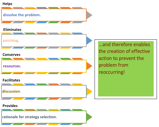
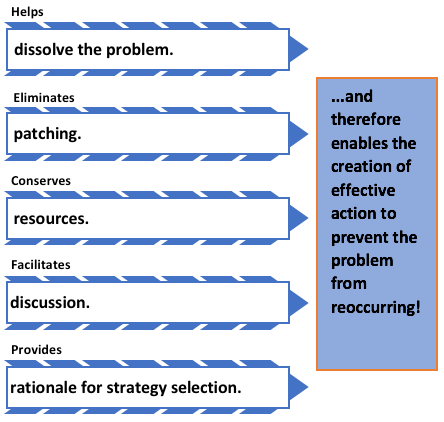
Here is a PPT slide that uses a rainbow’s worth of color, but not with intention (Figure 1)! The colors are random. This makes it difficult to focus on the message. Some of the text colors lack contrast to the background and do not follow accessibility guidelines making the text difficult to read.
Figure 2 presents the same PPT slide with a simple color palette and a high contrast between text and background. PPT slide in Figure 2 purposefully uses one color.
Figure 1: PPT Chart “Why Determine Root Cause?”
|
Figure 2: Appropriate use of color
|
Add color to communicate a specific takeaway or draw attention to the main point (Figure 3). Use bright colors for the most important data and muted colors for less important data.
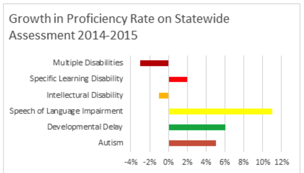
Use different colors to correspond to differences in the data or to group like data (Figure 4). In contrast, Figure 5 uses color at random and the colors serve no purpose in enhancing understanding.
Make sure that your use of color is purposeful by using logical color associations that highlight the point of the data (e.g., orange is an inviting color that depicts movement or energy without being as overwhelming or stimulating as red). See Visually’s infographic on color psychology for more ideas.
Figure 3: Most important data point is highlighted
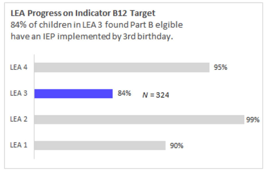
Figure 4: Color highlights the negative vs. positive growth
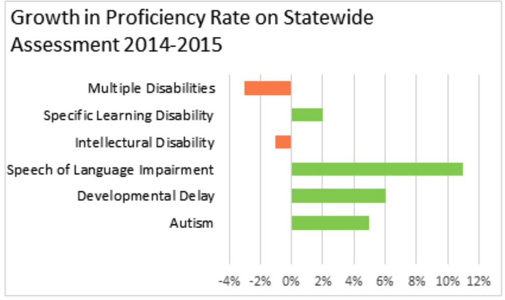
Figure 5: Color serves no purpose in this chart
Published December 2022.