
- Overview
- Toolkit Overview
- Introduction to Data Viz
- Resources
- General Considerations
- Accessibility
- Color
- Types of Visualizations
- Charts
- Dashboards
- Data tables
- Infographics
- Maps
- Qualitative
- Enhancing Engagement
- Animations
- Interactivity
- Presentations

Interactive visualizations prompt the user to directly engage with the data, creating opportunities for a full understanding of trends and relationships. As families and other key community members turn to the Web for quick information, making data dynamic is increasingly important.
Interactive Displays Design Principles
- Identify your goal: Do you want users to notice a particular trend or to freely explore relationships and information according to their own interests? It’s easy to incorporate many variables in an interactive visualization for exploration, but for focused messages constrain your visualization to demonstrate the takeaway point (Figure 1).
-
Help the viewer focus your message by highlighting relevant data points (e.g., LEAs missing evaluation timeline target).
- If you intend for users to explore multiple variables, give them the tools to manipulate and filter the data displayed. Try making your maps and data tables searchable and/or have them contain categorical filters.
- Avoid fancy or nonintuitive formats that make your data less clear or formats that don’t fit your message. These include unfamiliar structures and ambiguous color/shading use. Some data visualization tools will automatically generate possible formats for your data set—which can be more confusing than helpful (see Figure 2). When comparing Figures 1 and 2, which contain the same data, most people preferred Figure 1 for this particular data display.
- Make use of data windows to provide extra information, but keep the information to bite-size, relevant pieces. If you think more information is really relevant, have links in your data windows that lead to separate pages about that data point (a school website, for example). See Figure 3 for an example.
- Consider general and engagement strategy-specific accessibility tips and principles.
Figure 1: Focusing Your Message – Tableau Display of Local Education Agency (LEA) Evaluation Timeliness Data
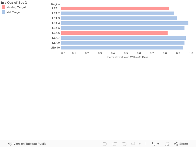
Figure 2: A Poor Example of Focusing Your Message – Local Education Agency (LEA) Indicator 11 Performance in 2014
Nonintuitive formats make your message less clear. In the display below, the “patchwork” display of data for the 10 LEAs is too unfamiliar to most people for them to be able to compare one LEA with another.
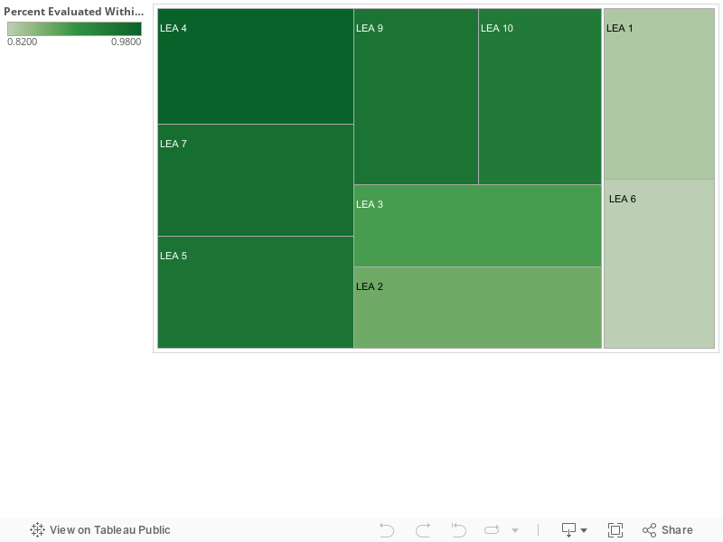
Figure 3: Using Data Windows to Provide Extra Information – A Head Start Locator Map

Published December 2022.