
- Overview
- Toolkit Overview
- Introduction to Data Viz
- Resources
- General Considerations
- Accessibility
- Color
- Caution: Read the Terms of Use
- Types of Visualizations
- Charts
- Dashboards
- Data tables
- Infographics
- Maps
- Qualitative
- Enhancing Engagement
- Animations
- Interactivity
- Presentations

A visual display can be helpful for generally comparing magnitudes or looking at trends, but sometimes providing specific data points is necessary. Data tables are useful for presenting data where specific data points, not just summary statistics or general takeaways, are important to the audience. Tables are also a good way to present both qualitative and quantitative data together.
Data Tables Design Principles
- Include in your table only the data that you want your audience to focus on. Extra information can be distracting if it’s not relevant to what you want your audience to consider.
- Be intentional with table titles, column titles, and color/boldness to emphasize the key takeaways from the data.
- Use a two-way table to examine associations between two variables. Table 1, an example table from Michigan, uses linked data and demonstrates the association between Part C exit ratings and Part B 619 entry ratings. The table uses color to highlight the association.
- Use a type font, style, and size for the table consistent with the surrounding text. The table text should not be smaller than or appear significantly different from the report or slide text.
- Use simple conditional formatting to highlight differences in the data, such as cells that are outliers or below/meeting a certain benchmark or target. Conditional formatting is a feature of Excel that will automatically highlight cells based on specified rules. Table 2 is an example of conditional formatting to highlight districts that meet a target.
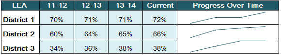
- Use spark lines (see Table 3) within a table as a quick graphical summary of a row of data.
- Consider general and or visualization-specific accessibility tips and principles.
Table 1: Use a Two-Way Table to Highlight Associations Between Variables

Table 2: Use Conditional Formatting to Highlight Distinctions
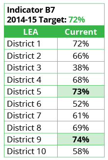
Table 3: The Addition of Charts Emphasizes the Table’s Message
Published December 2022.