
- Overview
- Toolkit Overview
- Introduction to Data Viz
- Resources
- General Considerations
- Accessibility
- Color
- Caution: Read the Terms of Use
- Types of Visualizations
- Charts
- Dashboards
- Data tables
- Infographics
- Maps
- Qualitative
- Enhancing Engagement
- Animations
- Interactivity
- Presentations
A dashboard is useful for displaying timely information on key variables that can be seen on one page or screen. A dashboard connects the viewer to the information, and when that information changes so does the dashboard; this time delay can be seconds, every quarter, or yearly, but you shouldn’t have to create a new dashboard when you need updated information. Dashboards can include information on one child, one school/program, an entire system, or a combination, and they are useful for measuring progress.
Dashboards Design Principles
The utility of dashboards is broadly recognized, and early childhood and education professionals are continually learning and ideas are evolving about how to design purposeful, meaningful, and user-friendly dashboards. Here are some basic design principles.
- Clearly define the purpose of the dashboard. Defining the purpose of the dashboard will determine the data to be displayed and the frequency of required data updates.
- Know your audience. In defining the purpose, consider the dashboard’s value to and use by the state, local agency, local provider, or family member – i.e., the audience. Keep in mind who the customers of the dashboard are, what information they need to see or use, and what their existing knowledge of the data is. This will ensure displaying the right and most relevant data to the right audience! Your colleagues and advisers can help determine what set of data is relevant, as well as the frequency of updates needed.
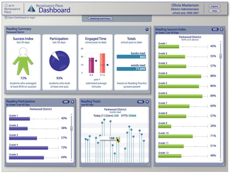
- Define the scope. A data dashboard can cover broad or specific information about an agency or initiative. For example, both dashboards below are designed for a school district administrator, but the scope of the first is broad school operations and student achievement and the scope of the second is narrowed to reading metrics specifically.
The dashboards below are relevant to the education community. They provide a quick overview of key indicators of operations and achievement. Figures 1 and 2 showcase several key design principles of effective dashboards. Both examples: (1) focus on a particular topic, (2) display key relevant data, (3) are easy to read, and (4) follow the principles of effective color use.
Figure 1: Dashboard for Early Interventions Providers
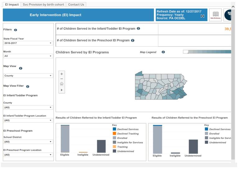
Figure 2: Dashboard Summarizing Progress in Reading
- Prioritize the most useful data to be displayed based on the purpose, audience, and scope of the dashboard. Viewers should be able to make sense of the displayed information at a glance.
- Determine whether you need a real-time or static dashboard. Dashboards are designed for different types of media. The main types of dashboards are online dashboards with real-time information and static dashboards requiring periodic updates of information. Real-time dashboards, which demand a constant and preferably automated data feed, are more appropriate for when decisions need to be made at a fast pace, such as information to inform services/instruction or to give immediate feedback to the intended audience. Static dashboards have a lower technical demand but still require regular information updates.
- Determine the contents of your dashboard and use principles of effective design for each element. Dashboards usually have multiple data displays, such as charts, gauges, and maps. Charts are great for displaying numeric data and are useful to help the viewer analyze data, especially when making comparisons or in understanding trends or compositions. Gauges (like the speedometer in your car) are visual displays that assist viewers with analysis of an indicator’s progress, quantity, or quality and should be used only to indicate current status of variable parameters. Maps are very useful when the analysis requires the discovery of patterns, such as regional levels of implementation of a certain indicator.
- Keep it simple. Just because it is possible, it’s tempting to include as much information as possible on a variety of types of displays. Instead, keep the dashboard as simple as possible to avoid clutter and to keep the relevant information easier to find and understand at a glance.
- Consider general and or visualization-specific accessibility tips and principles.
Published December 2022.