

- Overview
- Toolkit Overview
- Introduction to Data Viz
- Resources
- General Considerations
- Accessibility
- Color
- Caution: Read the Terms of Use
- Types of Visualizations
- Charts
- Dashboards
- Data tables
- Infographics
- Maps
- Qualitative
- Enhancing Engagement
- Animations
- Interactivity
- Presentations
The resources and tools below are provided as useful examples only. The DaSy Center is not affiliated with, sponsored by, or endorsing any of the listed resources and tools. For guidance on understanding how modern data visualization software handles data, visit the Caution: Read the Terms of Use section.
Maps Resources
The George Washington University Library system has an online repository of mapping resources, including examples of interactive maps, GIS data directories, and mapping tools.
Methods for Visualizing Geospatial Data on a Map
Maps are not all the same, and based on their advantages and limitations, some styles of maps are better at representing certain types of information than others. This resource describes 12 common methods for visualizing geospatial data to help you choose the right map for the data you want to illustrate.
Maps Tools
ArcGIS
ArcGIS This application specializes in mapping and spatial data analysis. It allows you to build maps with one or more layers (e.g., zip codes, school districts) and analyze associated data that has a spatial component. See the National Center for Education Statistics’ EDGE Geodata for an example of maps developed with ArcGIS.
BatchGeo
BatchGeo bills itself as the “fastest way to create Google Maps with your data.” BatchGeo allows you to layer your own data over Google Maps’ mapping resources. The tool has six map styles, with preformatted data window settings and area coloring, but it limits your options for further customization. See examples of BatchGeo maps in action.

Datawrapper
Datawrapper is a freemium web-based automatic chart-maker. EI and ECSE staff can upload or copy-paste their raw data, and Datawrapper will automatically generate customized charts and maps. Staff can then download visualizations as images or embed them in websites.
Excel
Microsoft Excel is one of the most widely used platforms for analyzing and displaying data. Excel Maps is available free with Excel 2016.
Flourish
Flourish is a freemium web-based data visualization application focused on interactivity and storytelling. Flourish features a variety of maps that can handle many granular boundary overlays, including Census tracts, zip codes, and school districts, by accepting GeoJSON files. Users can enhance maps with custom tooltips, animated point maps, and more. EI and ECSE staff can upload their data to create numerous data visualizations and embed them in websites. Flourish is geared toward non-GIS professionals and requires no coding experience.
Geocodio
Geocodio and Geocodio Maps
These tools provide hassle-free geocoding (i.e., address-to-latitude/longitude conversion) and mapping services. Maps can be enriched with dozens of built-in layers and geographical boundaries, including school districts. Geocodio Maps are free up to 250 records per map.
ggplot2
ggplot2 is a free, popular open-source data visualization package for the statistical programming language R. As an open-source software, it offers more analytic and creative flexibility and map types than most data visualization tools. However, ggplot2 requires coding experience with R, a popular open-source data science programming language. EI and ECSE data staff can download the tool and create endless custom charts, maps, and other visualizations.
Infogram
Infogram is a freemium web-based data visualization and infographic tool. EI and ECSE staff can create charts, infographics, dashboards, and maps and embed them in their websites. Infogram features artificial intelligence to enhance the workflow.
QGIS
QGIS is a free, open-source, desktop-based geospatial information system (GIS) software. EI and ECSE staff can create custom maps, perform geospatial analysis, and more. Staff can then publish maps to the web using various third-party options like plugins, servers, and cloud platforms. QGIS is a popular GIS alternative to ArcGIS.
Tableau Public
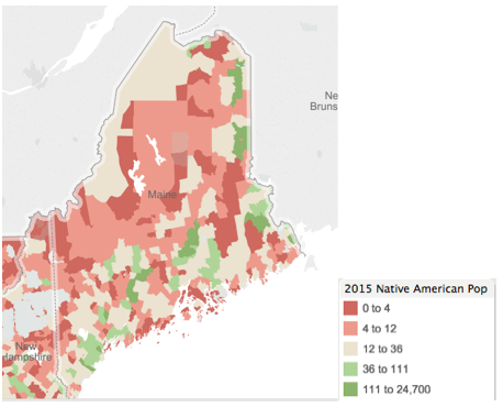
Tableau has many capabilities, and mapping is just one of them. Mapping capabilities include geocoding data, providing preset data layers of known U.S. census data, and creating individual points and polygonal maps. For more general information on Tableau Public, see the Interactive Displays section.
Updated July 2026.