
- Overview
- Toolkit Overview
- Introduction to Data Viz
- Resources
- General Considerations
- Accessibility
- Color
- Caution: Read the Terms of Use
- Types of Visualizations
- Charts
- Dashboards
- Data tables
- Infographics
- Maps
- Qualitative
- Enhancing Engagement
- Animations
- Interactivity
- Presentations
Maps Data Considerations
Maps are the best way to quickly convey any kind of geographical or regional data, such as population statistics, demographics, and achievements by region, or to map service providers such as schools, catchment area, Head Start locations, and clinics.
Individual Point Maps
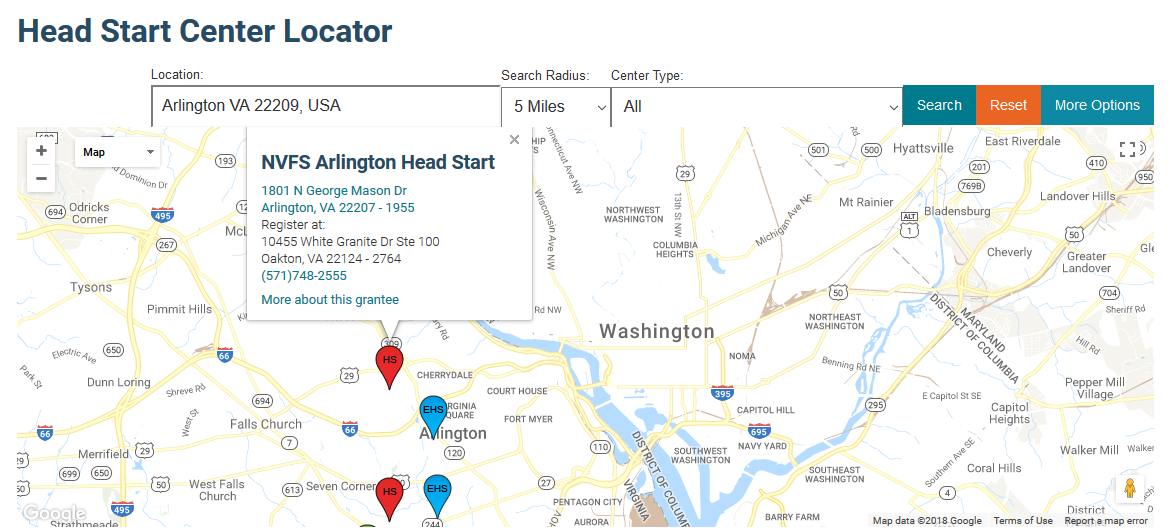
Any noncontiguous geographical data points—e.g., schools and other service providers— are best visualized in individual point maps. The Head Start Locator (Figure 1) is a great example of a searchable service provider map; note that the nodes are color-coded according to what programs are available (red denotes Head Start, and blue denotes Early Head Start).
Figure 1: Example of a Data Point Map
.
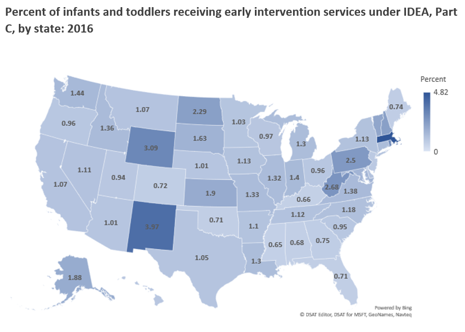
Filled/Polygon Maps
Filled or Polygon maps compare regions by using variation in color (Figure 2) and color intensity (Figure 3). Many tools will automatically fill regions for you according to geocodes such as Zip Codes, counties, cities, or states. If you have other regions you want to focus on—city blocks or districts not categorized by Zip Code, county, or town—you can create your own polygonal regions to fill, with more advanced tools and some programming knowledge. Check out the Google Maps Javascript API for a starting point in creating your own shapes/polygons. In addition, the National Center for Education Statistics provides geographic shape files (typically used in Geographic Information System [GI] or other more advanced tools) for school district boundaries.
The polygonal map of Pennsylvania in Figure 2 shows to what extent children are at risk of school failure in each county, based on the Office of Child Development and Early Learning’s Program Reach and County Risk Assessment, 2007-08.
Figure 2: Example of a Filled or Polygon Map That Uses Color Variation
Figure 3: Example of Filled or Polygon Map That Uses Color Intensity
This polygonal map was created using Excel Maps. The map uses darker color gradients to denote higher values. Download an Excel template for a U.S. map.
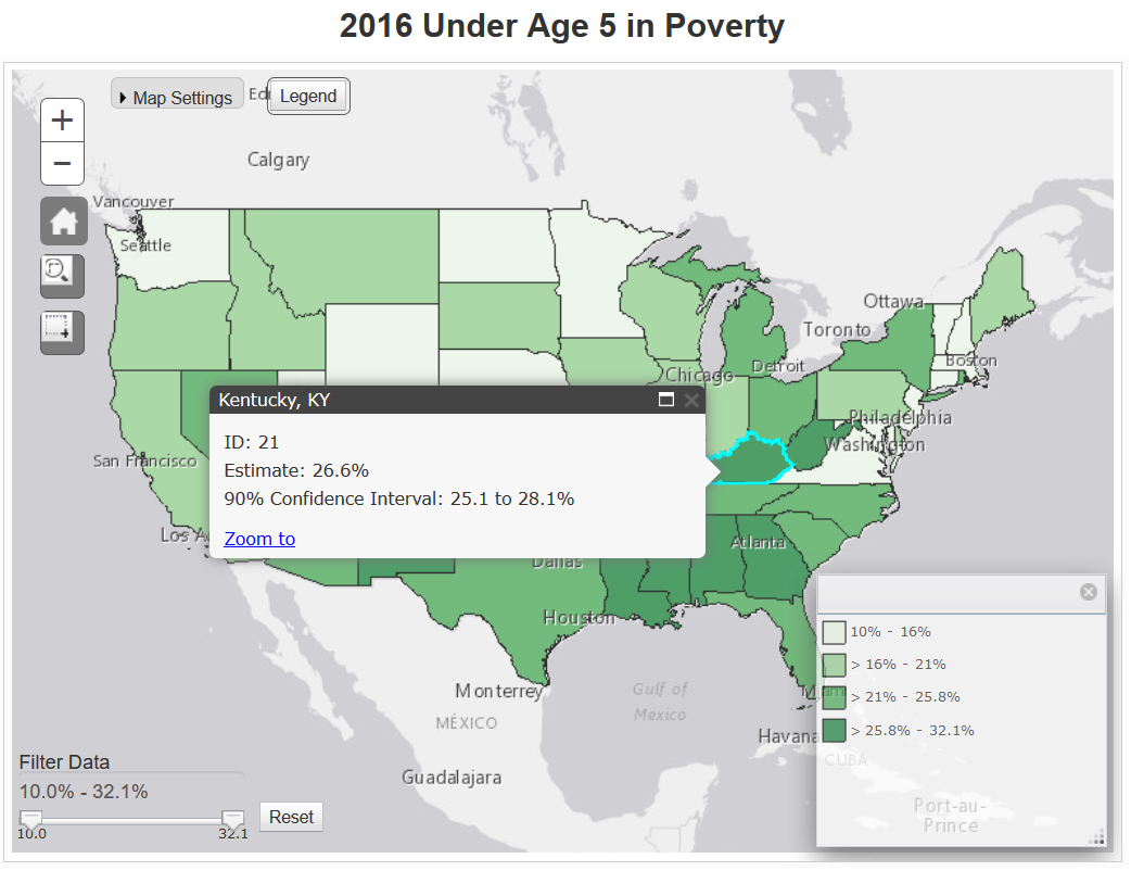
Data Windows
If your map is interactive, include data windows that pop up as a user hovers over a given polygon region or data point. These windows can include the specific numerical data for that point or descriptive information, such as name and phone number of a service provider. Figure 4 from the United States Census Bureau shows the percentage of children under age 5 living in poverty in 2016. Hovering over each state provides the state estimate and confidence interval. To use the interactive features, visit the Census Bureau website.
Figure 4: Data Window for Kentucky in U.S. Map
Published December 2022.