
- Overview
- Toolkit Overview
- Introduction to Data Viz
- Resources
- General Considerations
- Accessibility
- Color
- Types of Visualizations
- Charts
- Dashboards
- Data tables
- Infographics
- Maps
- Qualitative
- Enhancing Engagement
- Animations
- Interactivity
- Presentations
Charts Data Considerations
After identifying the main purpose of your chart, the next step in effective data visualization is to choose the best chart to display your data. Several common data types and suggested charts are detailed below, including example charts. Click on the example image to download an Excel template for each chart.
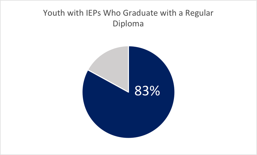
Single Number/Data Point
Pie charts are useful in highlighting a single percentage. Multiple pie charts can allow for easy comparisons across single data points.
Example:
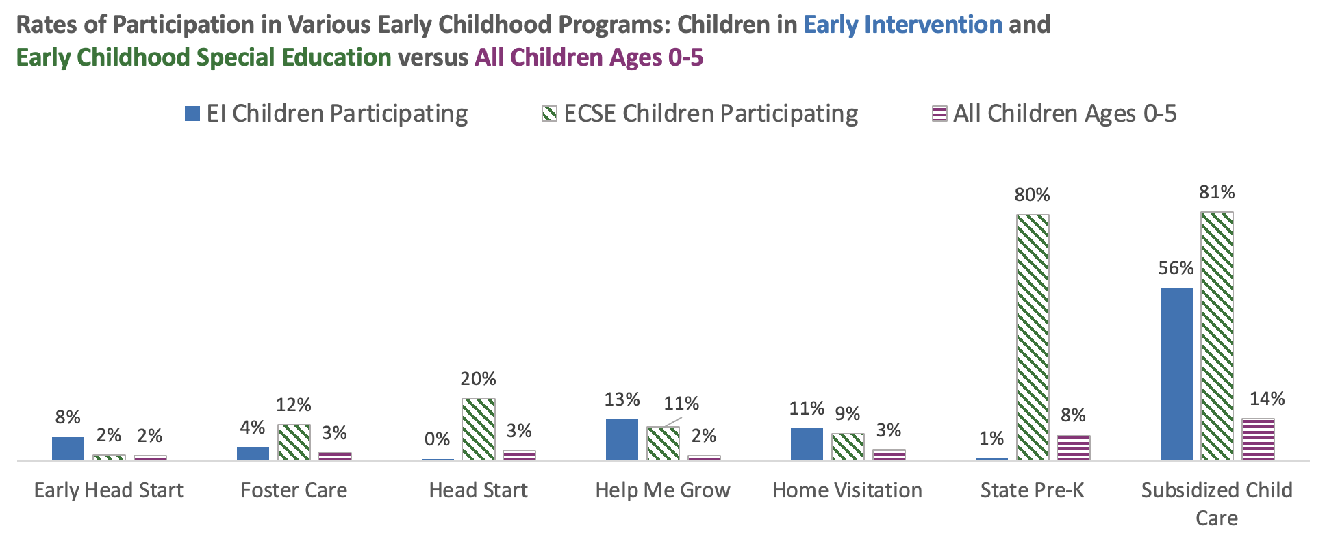
Comparison of Two or More Data Points
When comparing two or more data points column or bar charts, slope charts, or dot plots highlight the differences between data points.
Example:
Survey Responses
Survey responses can be summarized in a 100% Stacked Bar Chart or Diverging Bar Chart. For branching survey questions, Stephanie Evergreen’s blog has a great example of how to use a nested chart.
Example:

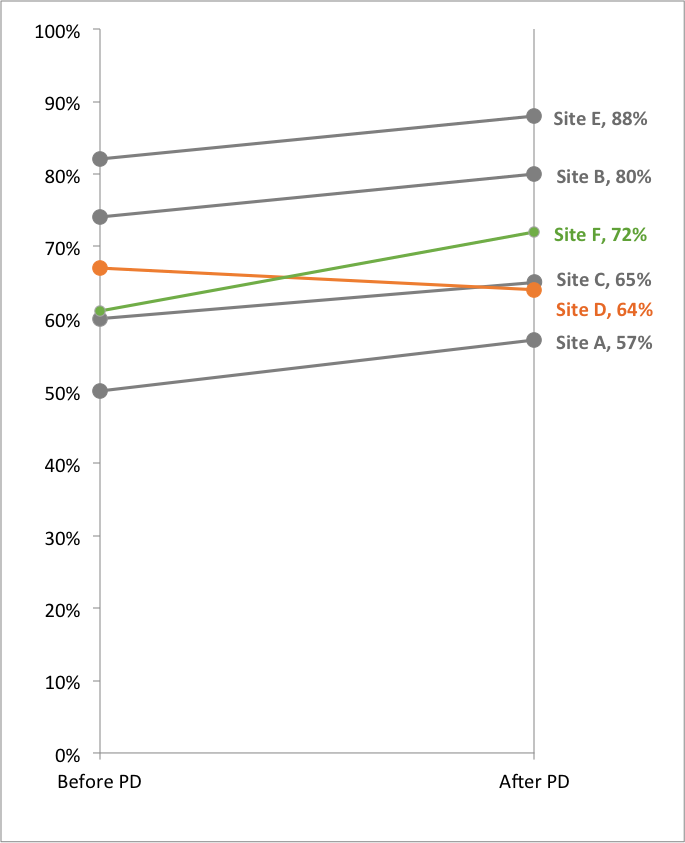
Data over Time
To show data that changes over time there are many options including the traditional line chart as well as slope charts, dot plots, and column charts.
Examples:

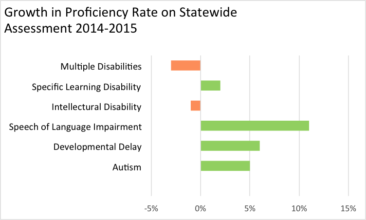
Data with Negative Numbers
A deviating bar chart is a simple way to display data that includes negative numbers.
Example:
Frequency and Distribution
Histograms are used to show the distribution of data and are good displays for frequency data.
Example:
A Large Amount of Data
As noted in the Design Principles, using multiple charts or small multiples—several mini charts in one—works well if you want to display many different categories, trends, relationships, or variables. A stacked bar chart is also an effective chart type when you have a large amount of data.
Examples:
Qualitative Data
When analyzing and interpreting qualitative data, it’s useful to identify common themes in the data. A heat map is one way to “chart” themes.
Example:

Published December 2022.