
- Overview
- Toolkit Overview
- Introduction to Data Viz
- Resources
- General Considerations
- Accessibility
- Color
- Caution: Read the Terms of Use
- Types of Visualizations
- Charts
- Dashboards
- Data tables
- Infographics
- Maps
- Qualitative
- Enhancing Engagement
- Animations
- Interactivity
- Presentations
Charts Accessibility Tips
- All images, including charts, must have alt text (alternative text) that describes the concept of the image. If a more complex chart is being described, a summary and table near the chart should both be used.
- Color choices are important. Use color to reinforce your message, but do not rely on it to show key details. See our Accessibility Tips for using color below.
This line chart is inaccessible with similar colors and no labels.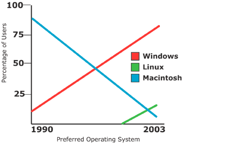 |
This accessible line chart uses different types of lines to show the data instead of relying on colors. There are also additional labels added.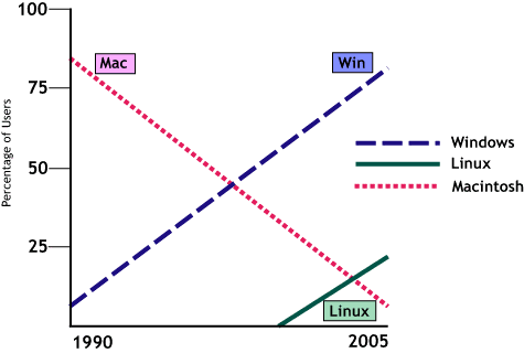 |
Penn State’s Accessibility and Usability site offers more details on how to make accessible charts.
Published December 2022.