- Overview
- Toolkit Overview
- Introduction to Data Viz
- Resources
- General Considerations
- Accessibility
- Color
- Types of Visualizations
- Charts
- Dashboards
- Data tables
- Infographics
- Maps
- Qualitative
- Enhancing Engagement
- Animations
- Interactivity
- Presentations
When we think of visually representing data, charts (or graphs) are typically what first come to mind. To avoid having charts that look like Excel defaults or uninspired, here are some tips for creating charts that accurately represent the data and fuel engagement in data-based action.
Charts Design Principles
- Use the chart type appropriate for the data you are presenting. Just because a particular chart is visually interesting does not mean it is the best for displaying your information. For chart type recommendations, see Data Considerations.
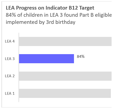
- Highlight the main finding or relevant data in your chart. Before charting data, identify the point you are trying to make by showing the data (see Stephanie Evergreen’s What’s your point?). Be intentional with titles, labels, and color/boldness to emphasize the key takeaway from the data. In Figure 1, the title and color drive home the key message.
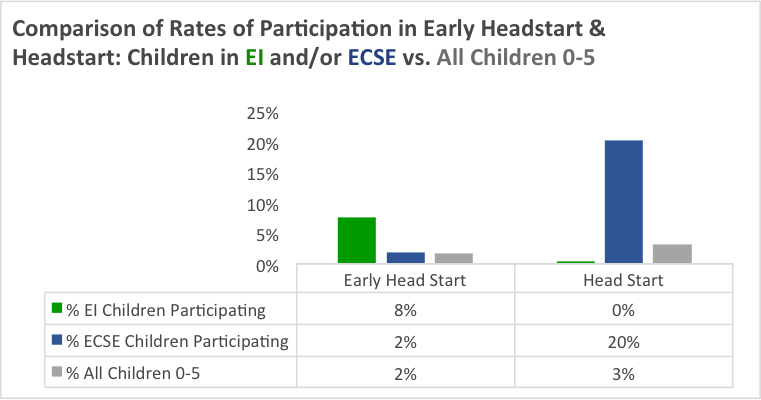
- Use consistent axis scales to avoid confusion or misleading data. Stephanie Evergreen’s blog post on where to start and end your y-axis scale provides some good rules of thumb. Add the n size if the chart uses percentages and the total number is not otherwise represented (Figure 1). Use labels to identify specific data points to aid in understanding or if relative magnitudes are difficult to decipher. Consider using a data table to add detailed information if it does not compromise the clarity of the chart or make it too busy (Figure 2).
Figure 1: Be explicit about the key takeaway
|
Figure 2: Add a data table to
|
| LEA = Local Education Agency | EI = Early Intervention; ECSE = Early Childhood Special Education |
- Avoid overformatting with background colors, 3-D effects, unnecessary gradients or patterns, and clip art. Eliminate “junk” such as unnecessary gridlines, borders, and labels. Less is more, as demonstrated in Figure 1.
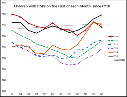
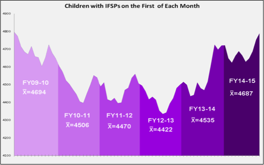
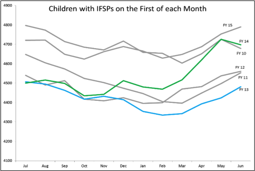
- Use multiple charts or small multiples — several mini charts in one (Figure 3) — to depict patterns and relationships. This works well if you have many different categories and trends to show, rather than using one chart that is too busy and overcomplicated (Figure 4). You can also selectively use color to focus on specific categories or trends (Figure 5 highlights fiscal years 13 and 14).
- Consider general and or visualization-specific accessibility tips and principles.
Figure 3: Too Busy to be Read Easily or Clearly
|
Figure 4: Small Multiples to
|
Figure 5: Using Color to Focus
|
Published December 2022.


