
- Overview
- Toolkit Overview
- Introduction to Data Viz
- Resources
- General Considerations
- Accessibility
- Color
- Types of Visualizations
- Charts
- Dashboards
- Data tables
- Infographics
- Maps
- Qualitative
- Enhancing Engagement
- Animations
- Interactivity
- Presentations
Qualitative Data Considerations
Display choosing tools for qualitative data (e.g., http://stephanieevergreen.com/qualitative-chart-chooser/) are available to help you determine which type of display is most appropriate for your data. Several common data types and example displays are detailed below. Infographics can also be an appropriate display type for qualitative data. Visit the Infographics tile for more information and examples.
Words
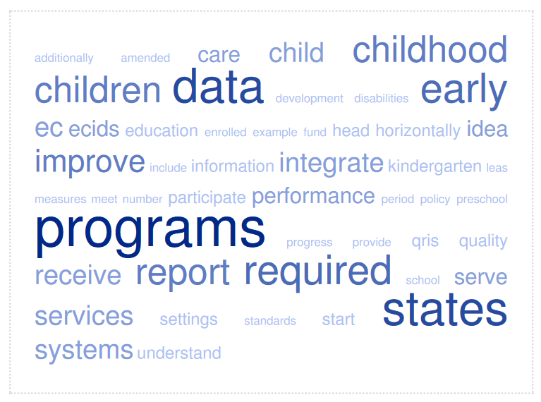
Word clouds provide a visual display of the number of times an individual word appears in a text. Typically, words that appear more frequently are displayed larger.
Figure 1: Word Cloud created using TagCrowd
Quotes and Comments
Adding pictures to quotes (Figure 2) or using callout boxes (Figure 3) can be used to visualize selected text or bring attention to important aspects of a longer text. Bolding text within a quote can drive home the key message.
Figure 2: Adding a picture to a quote can create a personal connection

“DaSy works with states to support IDEA early intervention and early childhood special education state programs in the development or enhancement of coordinated early childhood longitudinal data systems.” – Donna Spiker
Figure 3: Callout boxes and bolding draw the viewer in
Process or Theory of Action
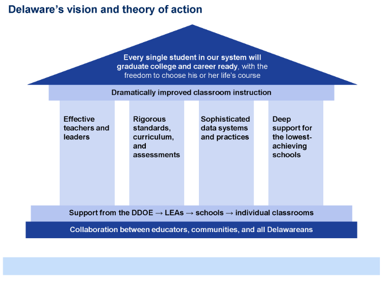
A process or complex concept can often be more easily understood in a visual than in text. Use SmartArt (Figure 4) or build your own diagrams using shapes (Figure 5). Click the process display to download a template.
Figure 4: Use SmartArt to make simple process displays
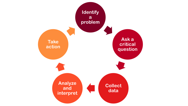
Figure 5: Building a metaphor into your visual can support understanding
Themes
Identifying and grouping common ideas or concepts in qualitative data is important to understanding and analyzing the data. Visuals, such as heat maps and evidence matrices, can display common themes. Click the heat map to download a template. To make your heat map interactive, see Stephanie Evergreen’s blog.
Figure 6: Heat Map Displaying Interview Data
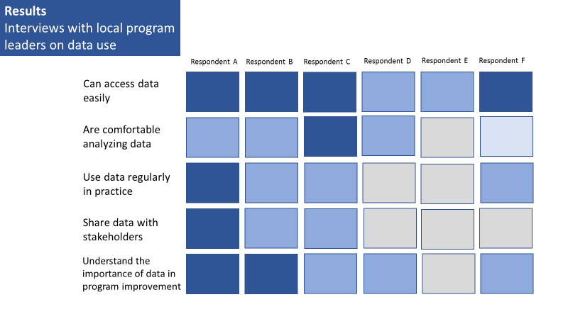
Figure 7: Evidence Matrix displaying open response data
| Data Collection | Using Data to Improve Practice |
|---|---|
| “As a program leader, I observe educator interactions with children regularly and document my observations on a standard form” | “I discuss each child’s assessment with educators to plan for how to improve practice” |
| “Children are assessed in the fall and the spring” | “I meet with my data team monthly to review child-level data and discuss the implications” |
| “Teachers fill out a daily log of incidents” | “After reviewing the parent surveys, we were able to make a change in how we do parent outreach and saw an increase in engagement” |
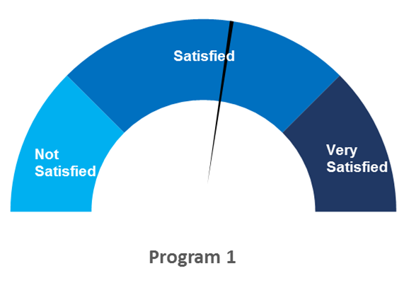
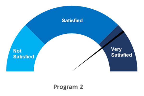
Comparison
Because viewers have a hard time measuring and comparing angles, as opposed to length, gauge diagrams are not well suited quantitative data. However, gauge diagrams can be useful in simplifying qualitative data, particularly when you are categorizing responses in up to three categories.
Click gauges to download a template. See full instructions on how to create gauges in Excel in this post by Excel Easy.
Figure 8: Gauge diagrams displaying parental satisfaction with program services
Published December 2022.