
- Overview
- Toolkit Overview
- Introduction to Data Viz
- Resources
- General Considerations
- Accessibility
- Color
- Caution: Read the Terms of Use
- Types of Visualizations
- Charts
- Dashboards
- Data tables
- Infographics
- Maps
- Qualitative
- Enhancing Engagement
- Animations
- Interactivity
- Presentations
Interactive Displays Data Considerations
As a web-based format, interactive visualizations are ideal for reaching clients, policymakers, families using early childhood services, and other interested parties. In particular, searchable tables and maps enable families to easily find services and customized information. Common interactive visualization formats and features are discussed below. For more advanced visualizations, consider engaging a programmer who can customize a visualization to your exact needs. See the Maps tile for more details on creating searchable and interactive maps.
One Time Point: Responsive Graphics and Charts
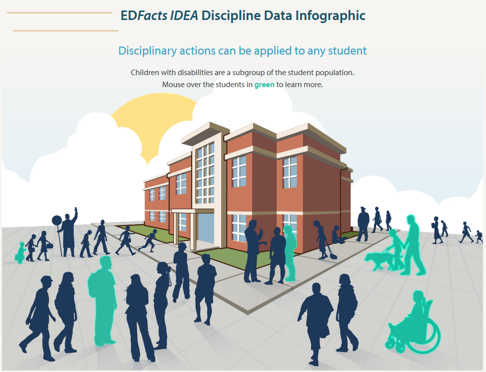
Responsive graphics can be made to grow, light up, change color, or have pop-up data windows appear in response to user interaction. A basic pie chart can become more engaging to online users if it’s responsive to their mouse. For example, in this pie chart, each slice enlarges and displays relevant information when the mouse hovers over. An interactive display of student discipline data (Figure 5) is another example. Users can mouse over the students in green to learn more about these statistics.
Figure 5: EDFacts IDEA Discipline Data Infographic
Click on the image below to go to the interactive infographic (this image is not interactive).
Data Over Time: Interactive Timelines
For displaying change over time, choose an interactive timeline that allows viewers to zoom in on their time period of interest.
Large Categorical Data Sets: Interactive Data Tables
Figure 7: Google Fusion Table of Local Schools, with Filters for Quality Ratings.
Interactive data tables allow users to manipulate large data sets to fit their needs – for example, searching by particular variables and ranges (NOTE: This image is static, not interactive).
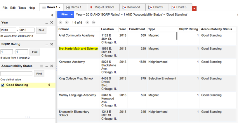
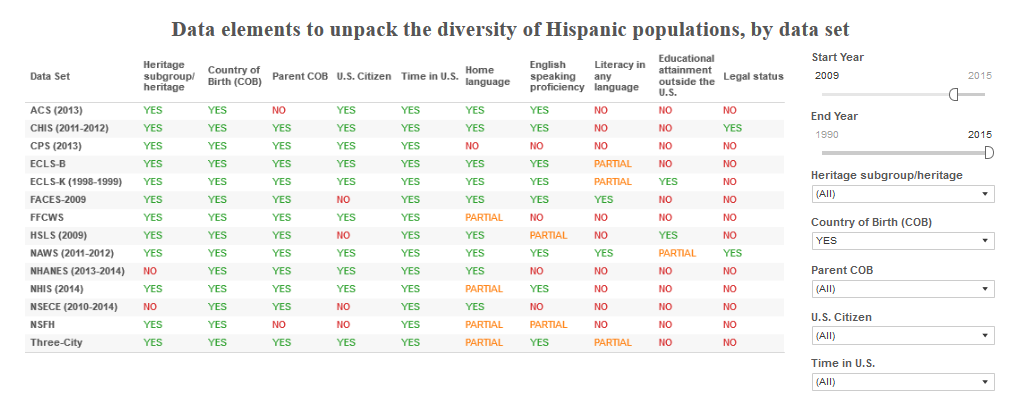
Figure 8: Tableau Table of the Diversity of Hispanic Populations, with Filters for Demographics
In addition to Google Fusion tables, you may also use tableau to create an interactive table with filters. view an interactive display created by the National Research Center on Hispanic Children and Families (Figure 8). See the Data Tables tile for more information on create data tables in Tableau (NOTE: This image is static, not interactive).
Service Providers: Searchable Point Maps
For users seeking specific services and programs—like Head Start locations, clinics, or schools—a searchable point map makes it easy to find nearby locations (Figure 9). Users can search maps for keywords or set categories, and data windows provide snapshots of relevant information. See the Mapping section for more information on mapping data.
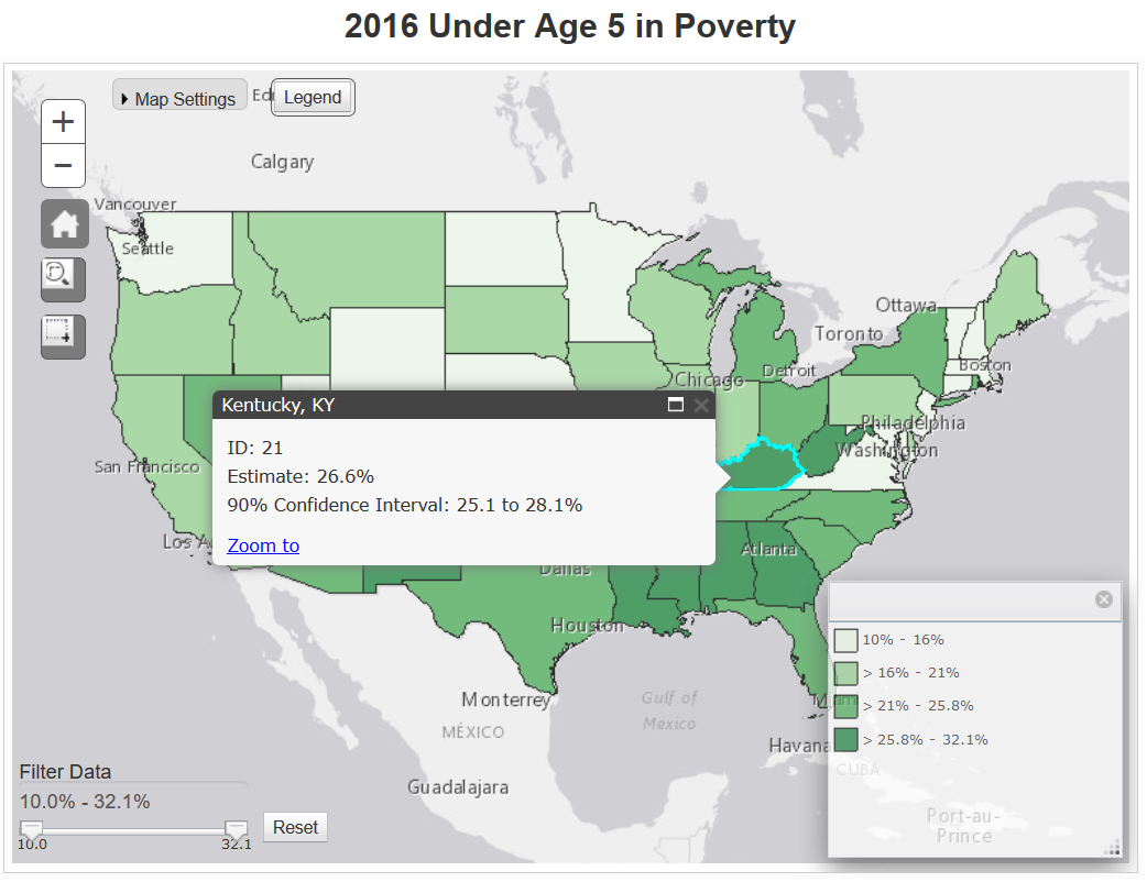
Data in Space and by Region: Dynamic Polygon Maps
Polygon maps highlight entire regions, making it easy to highlight changes in one variable across regions. To learn more about how maps can be used as data visuals, check out the Maps tile of the Data Visualization Toolkit.
Figure 10: Tableau Map – Kentucky in U.S. Map
This is another example of how maps can be made interactive by utilizing data windows that appear when a user hovers over a specific region, or, in this example, state. In addition to data windows, this example uses color to indicate which states have a larger percentage of children under age 5 in poverty. (Note: This map image is static, not interactive.)
Published December 2022.