
- Overview
- Toolkit Overview
- Introduction to Data Viz
- Resources
- General Considerations
- Accessibility
- Color
- Caution: Read the Terms of Use
- Types of Visualizations
- Charts
- Dashboards
- Data tables
- Infographics
- Maps
- Qualitative
- Enhancing Engagement
- Animations
- Interactivity
- Presentations
Infographics Accessibility Tips
- Communicate one central idea. Don’t try to do too much–keep to one central idea by layering and sorting information about that idea. Do not include extraneous information or visuals that do not support the central idea.
- Communicate the data clearly. The viewer should be able to perceive relationships in the data at first glance or reading.
- Create for different levels of engagement. Try thinking in three layers: must see, should see, and can see. The must see layer presents information that is vital to the infographic and should be made the focal point. The should see layer adds interest and insight. The can see layer is least important, but offers the reader more depth or an opportunity to explore.
- Make it easy to navigate. Create a clear hierarchy to help viewers navigate and locate information. The resource 15 Golden Principles of Visual Hierarchy offers principles for how to arrange and order your design.
- Keep it beautiful. Use good design–clear fonts, use of white space, harmonious colors.
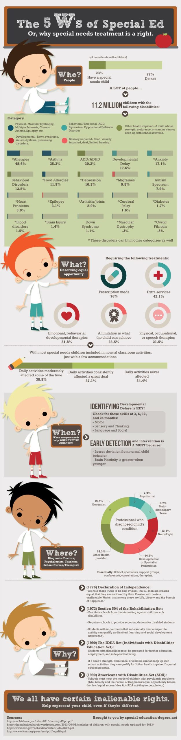
The key message conveyed through “The 5 W’s of Special Ed” infographic is that special needs treatment is a right (Figure 2). The 5 W’s (who, what, when, where, and why) constitute the must see layer, presenting the central idea that the 11.2 million children with disabilities deserve the same educational opportunities as those without. This is the focal point of the infographic. The should see layer provides additional context and includes such information such as the importance of early detection and diagnosis, the disability categories, and who can help. Finally, the can see layer consists of more detailed information, offers the viewer a deeper dive and an opportunity to explore, indicating the exact percentages of children in each disability category, the distribution of professionals who diagnose a child’s condition, and the descriptions of different pieces of legislation. View the full infographic.
Published December 2022.