The resources and tools below are provided as useful examples only. The DaSy Center is not affiliated with, sponsored by, or endorsing any of the listed resources and tools. For guidance on understanding how modern data visualizationsoftware handles data, visit the Caution: Read the Terms of Use section.
Dashboard Design Principles, posted by Beth Kanter on Beth’s Blog, in June 2011. This post describes the use of data dashboard for nonprofit organizations.
Shelly Engelman’s PARCS method
Helps users design dashboards in Excel through five steps: pivot, analyze, rename, chart, and slice. This resource also includes downloadable interactive dashboards.
Dashboards Tools
Google Sheets
Sheets is a free web-based spreadsheet application. Its functionality is similar to Excel, although it offers a range of unique tools. Sheets offers real-time collaboration, data exploration through machine learning, offline editing, and more. EI and ECSE staff can upload their data to create dashboards within Sheets by manipulating pivot tables, filters/slicers, charts, and more. Dashboards can also be enhanced using templates and artificial intelligence.
Infogram
Infogram is a freemium web-based data visualization and infographic tool. EI and ECSE staff can create charts, infographics, dashboards, and maps and embed them in their websites. Infogram also has an extensive library of royalty-free media. Infogram features artificial intelligence to enhance the workflow.
Looker Studio
Looker Studio is a free online tool for converting data into customizable informative reports and dashboards. Looker Studio can connect to a variety of data sets such as MySQL databases, Google Analytics, Google consumer products such as Sheets and YouTube, and social media platforms such as Twitter. See this dashboard and this dashboard for examples of Looker Studio in action courtesy of Arizona’s Part C program.
Microsoft Excel
Microsoft Excel, one of the most widely used platforms for analyzing and charting data, can also be used to develop data dashboards. You can create the dashboard in Excel, linked to a spreadsheet with the selected data for the dashboard. If you design the data spreadsheet to allow for data updates, you will be able to automatically update the dashboard as you update the data.
Skill Level
Intermediate/Advanced
Accessing the Tool
Microsoft Office, including Excel, is a licensed suite of software that requires purchase (Office 2015 or earlier) or a subscription (Office 365). To get a free 1-month trial or purchase a monthly subscription or license, go to Microsoft Office products website.
General How-To
An interactive dashboard in Excel starts with a data table, which can be called the source data, and a list of the graphs, charts and tables that have been chosen to be included on the dashboard. Each of the graphs, charts and tables to be included in the dashboard will be generated from the source data using pivot tables. For more information on pivot tables view the 23 things you should know about Excel pivot tables.
Items to be included in the dashboard: A data set for the dashboard should be built with the end in mind. You will need to know what the answers to the six data consideration items discussed earlier are. With that in mind, you will generate the source data table and a list of all the interactions across variables and whether they will be depicted via graphs, charts, tables or other formats in the dashboard.
Source data table: The source data to be used for the dashboard should be organized into one data sheet in tabular format. That means the data set should be organized with one row of headers which describe the data in the column below each title and should have no blank columns, no blank rows, and no merged cells.
Pivot tables: Once the source data is organized, and you know all the required interactions across variables (list of charts, graphs and tables), you will start generating pivot tables. Generate the first pivot table for the first item on your list of graphs, charts and tables to be included on the dashboard. Repeat the pivot table process for each of the items on your list, which will then, each of them, be saved on a separate worksheet.
Charts and Tables: For each of the tables you generated using the pivot tables command, on their individual worksheets, generate the appropriate chart or data table. Format consistently across all visual displays to be included in the dashboard (colors, notations, fonts, etc.).
Creating the Dashboard: After all charts and tables have been generated from each pivot table of data, it is time to create the dashboard itself. Open a new worksheet on the Excel file. Eliminate all gridlines on this worksheet and use the background design that is compatible the design you selected for all tables and charts. Use white background and no lines framing each chart. Once you prepared the background for the dashboard on this worksheet, copy and paste each of the charts into this space. Make sure the graph, chart or table that reflects the most important data point of the dashboard has a prominent space in the dashboard (please refer back to the principles of an effective dashboard for suggestions). Use the format tab in the ribbon to size and align the graphs and charts to what makes sense. Please note, in the format tab you will find the size function. Select the “move but don’t size with cells” option. This will prevent graphs and charts from changing their sizes even when cells change size, if you decide to write a title and other information on the dashboard.
Once you have the charts and tables organized, aligned and sized appropriately in this worksheet, you can copy and paste the information into a word document or link the worksheet to a website as is appropriate for the use and audience planned for the dashboard.
Tips for Creating Effective Graphs in Excel with Examples
The general instructions drafted here describe the basic steps to generate a dashboard using Excel. It does not include the details on how to use pivot tables, and it assumes you will select and design charts or tables based on information from other sections of this document. Excel allows for you to generate dashboards with more features than the ones described here. A quick search about generating dashboards using Excel on “Youtube” should generate a good amount of videos that will explain in more detail each of the steps we described here.
Limitations
Excel 2013 and earlier versions do not have a native real-time/online dashboards feature. In that case, this would be more of a static dashboard (like a template) in which data could be imported but changes to the data should be edited to the data source manually. Nonetheless, Excel offers a solid platform to creating dashboards, and you can make changes as frequently as new data can be generated. It will require some effort, but once you created one dashboard, you can make as many copies of the file as you wish, and as long as the source data format is maintained, you can generate a new dashboards.
Power BI
Power BI
This is a data analytics and visualization tool from Microsoft. Users can create interactive dashboards and reports.
Tableau
Tableau is a dynamic tool with many capabilities. Drag and drop data sets and variables into interactive data dashboards, and export your visualizations online or in graphic form. Tableau Public is the free version, which has advanced capabilities but requires that all data be public. Here is an example dashboard that uses Tableau embedded in a website to visualize early childhood data.
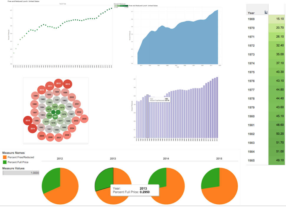
Get comfortable with Tableau’s “shelves” system, a drag-and-drop interface for variables. Moving elements to different shelves can dramatically change the display; experiment until you find a good fit. See figure 9 below for an example of different graphics automatically created from one data source in Tableau.
Tableau has background data layers from census data, such as U.S. population and other demographics, which can be automatically overlaid in any map visual.
Tableau autogenerates categories like “measure names” that can be dragged into the Details shelf to create custom labels.
Experiment with the Color shelf for your data, which includes categorical and gradient features in attractive (and not-Excel!) themes.
Limitations
For the free Tableau Public software, any saved workbooks are available online to the public—so do not use it for confidential data!
For very large data sets or private data services, Tableau requires the purchase of a Tableau plan.
When embedding this application, be aware that applications headings may appear that could be distracting for users.
Figure 11: Same data, six ways in Tableau: Percentage of Students Using Free or Reduced-Price Lunch, 1969-1985
Updated July 2026.
If you require an accommodation to access any DaSy Resource, please contact DaSy.