
- Overview
- Toolkit Overview
- Introduction to Data Viz
- Resources
- General Considerations
- Accessibility
- Color
- Types of Visualizations
- Charts
- Dashboards
- Data tables
- Infographics
- Maps
- Qualitative
- Enhancing Engagement
- Animations
- Interactivity
- Presentations

Accessibility is “the practice of ensuring that as many people as possible can use, understand, and have access to a technology, infrastructure, tool, product, or service” (Chartability). Accessibility is essential to creating an inclusive data experience for people with disabilities. The following guidelines will help ensure that your data displays are accessible to your audience.
Accessibility Design Principles
- All graphics (e.g., charts, tables, images, photographs, and maps) must have alternative text (alt text) that describes and summarizes the nature, concept, and content of the graphic. The content of the alt text is read by assistive technology such as screen readers and provides people with visual impairments access to the information conveyed in the graphic.
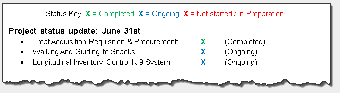
- Do not use color as the only means to convey information. Communicate the information using text as well. Use color to reinforce your message, but do not rely on it to show key details.
- Avoid having flashing/flickering or animated text.
- Use headings and labels such as figure titles and captions to describe the content and its purpose.
- Provide a way to identify the meaning of all acronyms and other less common words and phrases (e.g., providing an acronym list or defining when the term is first used).
- Some tools and software, such as Microsoft Office, have built-in accessibility checkers. These checkers run a search to find potential accessibility issues and offer suggestions for resolution. It’s important to note that these accessibility checkers have limitations and should not be relied on to declare your file fully accessible. Additional steps may be required to ensure files are fully accessible. Learn more about about Microsoft Word, Excel, and PowerPoint accessibility checkers.
Color Accessibility Tips
- In general, avoid using color-coding as the only means to convey information. However, if you do choose to use color differences to convey information, make sure that the information conveyed by the color differences is also conveyed explicitly in the text.
 |
 |
- Make sure there is enough contrast between foreground and background colors to make the content accessible to individuals with color blindness. (The standard contrast ratio is 4.5:1) These Web Accessibility Guidelines provide combinations that meet color contrast requirements. Use a color contrast checker to ensure the foreground and background colors meet color contrast requirements. This interactive Contrast Checker can help you determine the correct ratio.
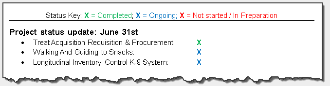
- Avoid traffic light (yellow-green-red) color schemes. Green and red are indistinguishable for people with red-green color-blindness. See Stephanie Evergreen’s blog for more information.
- Keep in mind that while some links, such as navigational links, may be visually evident from page design and context, links within text are often visually understood only from their own display attributes. If the only attribute that sets your link apart from the rest of the text is color, people who cannot perceive color may be unable to notice it. To avoid this, make the link bold and/or underlined, to set it apart.
For more information on alt text see the Diagram Center’s Image Description Guidelines.
Published December 2022.