
Learn how DaSy can support state efforts to build high-quality data systems and use data to improve programs and outcomes for young children with disabilities and their families.
What DaSy Can Do For You Webinar

Learn how DaSy can support state efforts to build high-quality data systems and use data to improve programs and outcomes for young children with disabilities and their families.

State Part C (early intervention) programs must report annually to the Office of Special Education Programs (OSEP) about how well the programs supported families to understand their rights, advocate for their children’s needs, and support their children’s learning and development.

DaSy, ECTA, and the Waters Center for Systems Thinking teamed with four states to improve their Part C/619 programs by increasing the knowledge and skills needed to improve data culture and become systems thinkers.

In this workshop from IDIO 2024, DaSy/ECTA staff guided participants through a multi-layered approach to analyzing data at a deeper level than normal.

Are you looking for an easy tool to help you begin analyzing your data? In this video tutorial series, you will learn about the pivot table, a powerful tool in Microsoft Excel that lets you quickly slice and dice your data in numerous ways. You will never look at data analysis the same way again!
Overview Data Leadership Competencies Data Foundations Data Analysis Data Use & Sharing Introduction Data Visualization: Key Considerations Data Visualization: Key Considerations for Effective Data Visuals When presented effectively, data are […]
Overview Data Leadership Competencies Data Foundations Data Analysis Data Use & Sharing Introduction Data Literacy: Evaluating the Implementation of Evidence-Based Practices Looker Studio Video Tutorial Series Using Data to Understand […]

Part C and Part B 619 Data Managers and Coordinators have ongoing reporting deadlines. So, what do you do with high priorities that lurk on the radar with no time to address them? Here are the areas to make space for in your calendar today and on an ongoing basis. Any steps in these areas will help make the big deadlines easier, too.
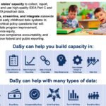
Conference: OSEP Leadership Conference Date: July 2023 Presenter: Sue Barlow, Michelle Lewis, Nicholas Ortiz, Kellen Reid In this poster from the 2023 OSEP Leadership Conference, DaSy highlights its mission, services, […]
Overview Data Leadership Competencies Data Foundations Data Analysis Data Use & Sharing Introduction Data Literacy: Evaluating the Implementation of Evidence-Based Practices Looker Studio Video Tutorial Series Using Data to Understand […]