

Authors: Robin Nelson, Lauren Jackson, Nicholas Ortiz
The Data Visualization Toolkit is one of DaSy’s most popular resources with thousands of visitors each year. We made only minor updates in 2018. At six years old, there’s bound to be wear and tear, a need to bring things up to code or to modernize technology, and so on. So, we did some remodeling and repairs. We re-organized, made some additions, and let go of a few things that were past their prime.
What’s new?
The toolkit has improved navigation and new resources. We grouped topics more logically, and eliminated clutter and redundancy.
Improved Organization
We have improved the overall layout with four main sections: Overview, General Considerations, Types of Visualization, and Enhancing Engagement. These sections differentiate between specific types (e.g., tables, maps) and more cross-cutting features such as color and accessibility, or ways to enhance audience engagement (e.g., interactivity, animations).
Getting Started: Toolkit Overview
The Overview section contains some general, foundational resources. If you are new to data visualization, they are sure to inspire plenty of ideas to get started.
General Considerations: Color and Accessibility
This new section includes color because color is a feature of most types of visualizations. We have also added another topic to the General Considerations section: Accessibility. You will find design principles as well as resources and tools for using this lens.
- Order labels purposefully. Don’t order data in tables, graphs, and charts as they are ordered in the data.
- Avoid generic, neutral chart titles in favor of titles with a key takeaway.
- Use qualitative data and narrative to help tell the story behind the numbers.
- Color: Color choices should always be intentional. The Color section outlines design principles on the use of color and how those are influenced by data considerations. There are several resources with practical tips on use of color.
- Accessibility: The Accessibility section will help make your data visualizations usable by as many people as possible, especially those with disabilities. This section provides accessibility tips for various types of data visualizations as well as tips for using color, animation, and more.
Enhancing Engagement: Animation, Interactivity and Presentations
We moved the pre-existing content on presentations, interactive displays, and animations into a new section on ways to present data in persuasive, memorable, and engaging ways.
- The Presentations section has tips to tell a data story with intention.
- Adding Animations can bring data displays to life and make your point memorable.
- Interactive visualizations prompt users to explore the data for a fuller understanding of details.
New Resources and Tools in the Types of Visualization Section
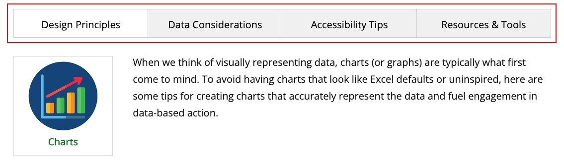
This section now includes Charts, Dashboards, Data tables, Infographics, Maps, and Qualitative types of visualizations. For each, you will find design principles and data considerations as well as resources and tools, including some accessibility issues. Resources provide content on how to develop visualizations whereas Tools can be used to create visualizations. The new resources and tools are denoted by next to the resource or tool.
Data visualization continues to be a hot topic in all sectors, including education, health care, government, and business. It is essential in helping to interpret data and to communicate information. When we can easily turn data into useful information, it becomes actionable. We hope you use this toolkit to advance this goal in your own work.
Explore the updated Data Visualization Toolkit.
If you have questions, your DaSy liaison can assist you, or contact DaSy anytime.
About the Authors

Robin Nelson, Ph.D., is a DaSy TA provider with more than 30 years of experience in program evaluation and applied research in education, social, and human services. Prior to her work with DaSy, she directed outcomes, evaluation, and data systems activities for Texas’ Early Childhood Intervention (Part C) program for more than 12 years.

Nicholas Ortz, MPA, is a DaSy TA provider with a passion for visualizing data in fresh, creative ways. He has 14 years of combined experience in state government and research organizations providing large-scale training, TA, and data services. He previously managed Colorado’s preschool special education (619) data and Results Matter Colorado, the state’s nationally recognized early childhood assessment system.

Lauren Jackson is a DaSy coordinator with an interest in qualitative data and family engagement. As a former classroom teacher, she is passionate about improving outcomes and experiences for all children and families.
Published December 2022.