The resources and tools below are provided as useful examples only. The DaSy Center is not affiliated with, sponsored by, or endorsing any of the listed resources and tools. For guidance on understanding how modern data visualizationsoftware handles data, visit the Caution: Read the Terms of Use section.
Tableau is a dynamic tool with many capabilities. Drag and drop data sets and variables into interactive data dashboards, and export your visualizations online or in graphic form. Tableau Public is the free version, which has advanced capabilities but requires that all data be public.
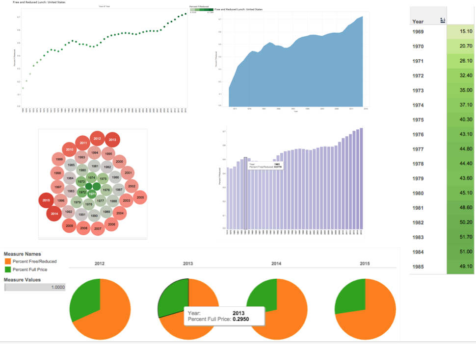
Get comfortable with Tableau’s “shelves” system, a drag-and-drop interface for variables. Moving elements to different shelves can dramatically change the display; experiment until you find a good fit. See figure 9 below for an example of different graphics automatically created from one data source in Tableau.
Tableau has background data layers from census data, such as U.S. population and other demographics, which can be automatically overlaid in any map visual.
Tableau autogenerates categories like “measure names” that can be dragged into the Details shelf to create custom labels.
Experiment with the Color shelf for your data, which includes categorical and gradient features in attractive (and not-Excel!) themes.
Limitations
For the free Tableau Public software, any saved workbooks are available online to the public—so do not use it for confidential data!
For very large data sets or private data services, Tableau requires the purchase of a Tableau plan.
When embedding this application, be aware that applications headings may appear that could be distracting for users.
Figure 11: Same data, six ways in Tableau: Percentage of Students Using Free or Reduced-Price Lunch, 1969-1985
Updated July 2026.
If you require an accommodation to access any DaSy Resource, please contact DaSy.