
- Overview
- Toolkit Overview
- Introduction to Data Viz
- Resources
- General Considerations
- Accessibility
- Color
- Equity
- Types of Visualizations
- Charts
- Dashboards
- Data tables
- Infographics
- Maps
- Qualitative
- Enhancing Engagement
- Animations
- Interactivity
- Presentations
What is Data Visualization?
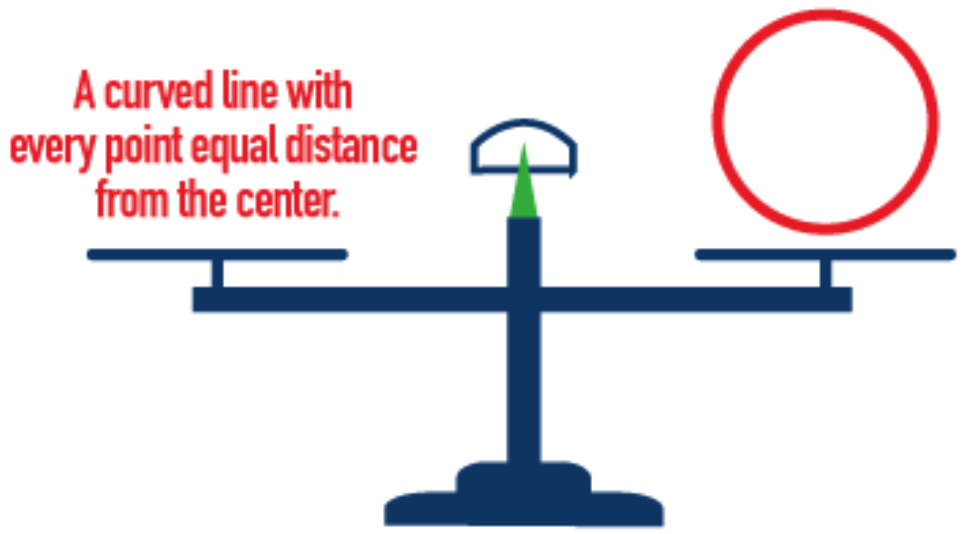
When representing a circle, a visualization is much clearer than a verbal description.
Data visualization is the visual representation and presentation of data to enhance understanding. When data consumers see data presented visually, they are better able to grasp difficult concepts, identify new patterns, or more efficiently take away key messages.
Why is Data Visualization Important?
Because of the way the human brain processes information, people tend to find it easier to interpret visual representations of complex data rather than poring over spreadsheets or reports. Data visualization is an essential aspect of effectively communicating data and findings.
Why use data visualizations?
Regardless of industry or size, all types of organizations are using data visualization to help make sense of their data. Here’s how.
- Comprehend information quickly. By using visual representations, state and local data users are able to see large amounts of data in clear, cohesive ways – and draw conclusions. Because it’s significantly faster to analyze information in visual form (as opposed to in spreadsheets), state and local program staffs can address problems or answer questions in a more timely manner.
- Identify relationships and patterns. Even extensive amounts of complicated data start to make sense when presented visually, and data users can recognize patterns and relationships in the data. Identifying those relationships helps data users dig deeper and ask better questions about the data.
- Pinpoint outliers and potential data quality issues. Using data visualization makes it easier to spot outliers and identify a potential data quality issue before it becomes a bigger problem.
- Communicate the story to others. Once a data user has uncovered new insights from data analysis, she or he needs to communicate those insights to others. Using effective data visualization to tell the data story is essential to engaging community members and supporting understanding and action.
Of course, no matter how good the visualization, if it’s not based on high-quality data, then it can lead to inaccurate conclusions. High-quality data is a foundation for good data visualization.
Published December 2022.