
- Introduction
- Federal Requirements
- General Considerations
- Steps for Setting Targets
- Approaches for Target Setting
- Examples of Data Visualization
- Indicator Specific Guidance
This section provides examples of data visualizations that states may consider creating to share with stakeholders during the target setting process. Most of the examples are intended to help stakeholders better understand various aspects of the data. The last figure is intended for displaying a summary of the results of different target setting approaches. Each of these charts was created using Excel. DaSy’s Data Visualization Toolkit provides more resources on the creation and use of data visualization products.
Figure 1. Historical Data for Indicator C3 or B7.
Figure 1 is a simple bar graph of historical data for the summary statements for each of the three child outcomes. The funnel-shaped filter can be used to focus on a subset of data such as outcomes or years. A shape or text can be inserted to indicate the baseline year.
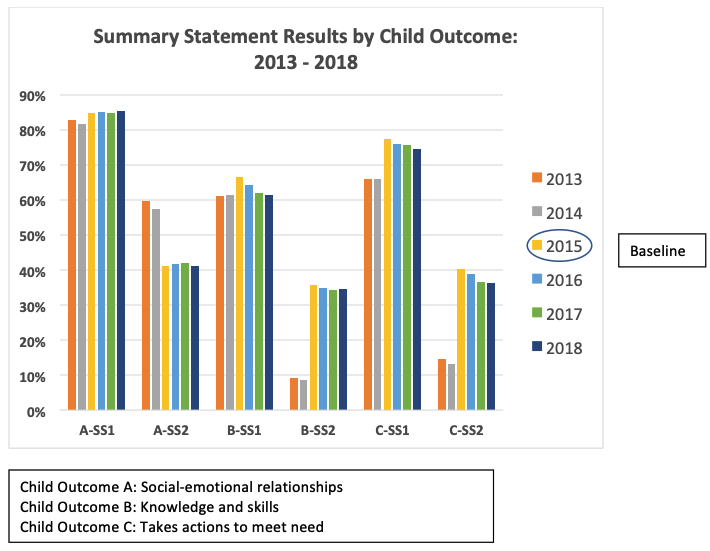
Figure 2. Bar Graph with Contextual Information.
The graph in Figure 2 displays historical data in a slightly different way, with data for the three family outcome indicators grouped by year. The graph also adds important contextual information, i.e., survey response rates for each year.
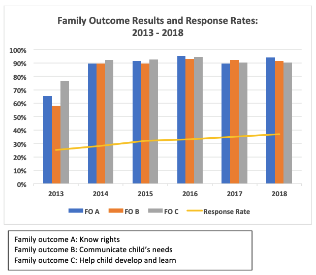
Figure 3. Percent Birth-to-Three Served by County.
The map in Figure 3 displays the percent of children ages birth to three served in Part C, by county. Though the map does not show data over time, it helps stakeholders look beyond the statewide data at the variation across counties (or local programs/districts). These county-level data are fictitious.
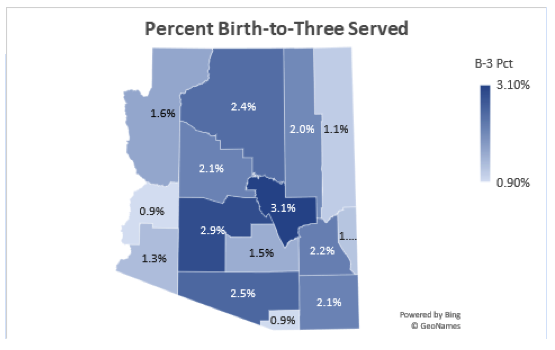
Figure 4. Family Outcome Results vs. Targets, Bar Graph.
The following two examples (Figures 4 and 5) display the same data. The first uses a bar chart and the second uses a line graph. They both display the historical data for one family indicator, knowledge of rights (A), relative to the target for the same year.
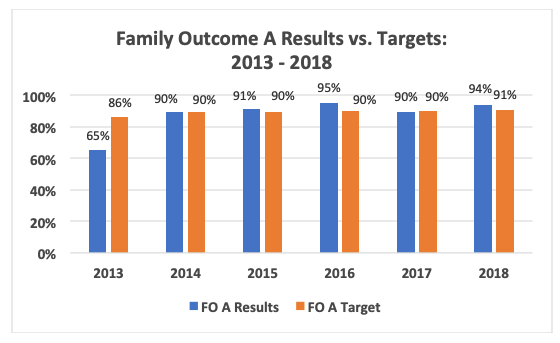
Figure 5. Family Outcome Results vs. Targets, Line Graph.
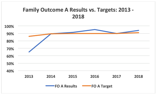
Figure 6. Percent Birth-to-Three Served and Population Data, by County.
This is an example of a combo chart that displays the percent of the birth-to-three population served using the blue columns and the primary axis on the left, and the total birth-to-three population displayed using the orange line and the secondary axis on the right. Disaggregating the data by county (or local program/district) can reveal the extent of variation in the indicator across those entities, and the addition of the population data adds critical contextual information. Counties (or local programs or districts) with a much greater number of children are more likely to influence the statewide results.
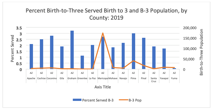
Figure 7. Using Filters or Slicers to Focus on Specific Information.
This example illustrates the use of filters (in a chart) or slicers (in a PivotChart) to focus on specific information, such as subsets of data. Users of this PivotChart would be able to use slicers to look specifically at the child outcomes progress categories for one or more counties. (The county-level data are fictitious).

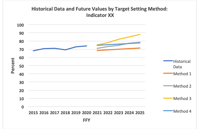
Figure 8. Summary of Target-Setting Approaches.
This graph displays the historical data for an indicator and the future values (targets) for each of the different target-settings methods used.
Published June 2021.